From Old to New Dated to Fresh Farmhouse Makeover
Jan 28, 2021 | Carpet One Floor & Home
Taking an old home that carries history and everlasting charm and renovating it to create a fresh modern oasis while staying true to the authenticity of the home takes a delicate touch and a meticulous mindset. Tennille Wood from Beautiful Habitat succeeds at the task with this 1890s home, demonstrating how a transformation can truly evoke a new love for an old home.
We’ll take a look at the before and after of the project, seeing how renovating an older home to make it 21st-century functional can be accomplished by adding new rooms in unused spaces, redesigning bathrooms, and updating fixtures like lighting, flooring, and cabinetry. We’ll see how Tenille took a traditional space from outdated to fresh and modern with the addition of a master suite and updated finishes that make the home pop. Recessed lighting, custom wood features, and a brand-new master will show how Tenille was able to capture the original beauty of the home, while the added upgrades further accentuate the touches that make this home one-of-a-kind.
The Kitchen
The 1890s galley kitchen that was last remodeled in the 1960s left plenty of room for rejuvenation. With a tight footprint, the primary challenge was how it could be upgraded to provide a sizable kitchen solution with enough space to complete tasks. Removing the original brick chimney was the perfect place to start. Leaving plenty of room for a new peninsula that wraps around the corner, the kitchen quickly became more than double the original size, creating a space that is comfortable, practical, and enjoyable.
The size of the kitchen wasn’t the only challenge, however. Home renovations often bring unique obstacles that require several workarounds. In this kitchen, a ceiling beam had to be added to carry the weight of the new master suite upstairs. Rather than allowing the beam to halt progress, the team opted for a coffered ceiling that proved to be even better than the previous.
The new ceiling is decorative and detailed and provides the touch of elegance that this traditional home deserves.
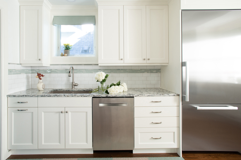
Wood cabinets, tile countertops, and paneled lighting were also in need of an update. State-of-the-art off-white shaker cabinets and white backsplash tile replaced the old elements and highlight the new farmhouse feel. The light blue accent tile lined at the top of the simple white backsplash adds a bit of detail and color to the space and also ties in with the light blue in other rooms.
Along with the size of the kitchen, the addition of the new ceiling, updated cabinets and backsplash, stainless steel appliances, brushed nickel handles and knobs, and a touch of color on the area rugs in front of the workspaces establishes the tone of the farmhouse home and upholds the raw beauty of this traditional 1890’s home.
The New Bathroom
The original bathroom in this home was shared between four bedrooms, so removing the fourth bedroom and using the space for something else was the perfect opportunity to build a spacious and luxurious new bathroom. Two-thirds of the old bedroom was used to make space in the new bathroom, which now features a walk-in shower, slipper tub, and double vanities. The new pieces and increased amount of space truly revitalized this outdated room and made it into a spa-like sanctuary.
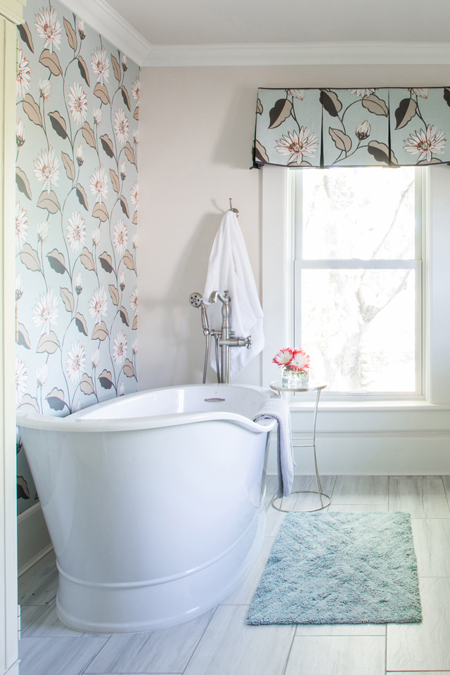
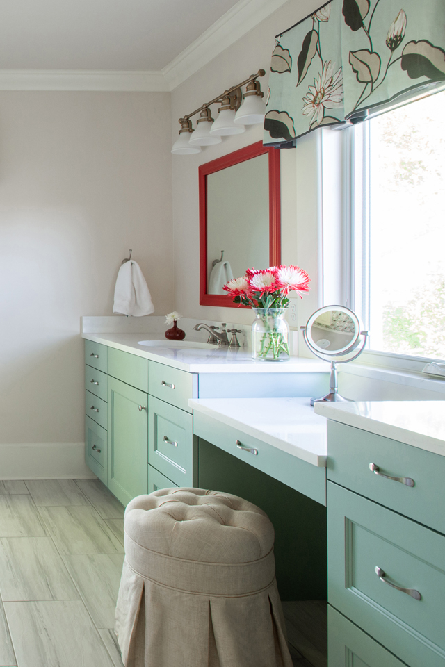
The design was just as important as the amount of space. Large scale floral wallpaper on one of the walls and a more neutral paint color on the other walls adds fun, color, and personality without taking it over the top. The custom cabinets echo the blue-green color of the wallpaper to collectively create a fresh, modern look. The center of the flowers on the wallpaper is red, which made choosing a red accent on the mirrors an easy decision: it brightens up the room and adds a pop of color.
Large windows bring just the right amount of light into the bathroom, and two unique light fixtures installed above the mirrors supplement that light on dark days or evenings. The nearly bronze color of the light fixtures makes the space feel classy, while the brushed nickel handles on the cabinets combine mixed metals in this bathroom, bringing in some modern flair.
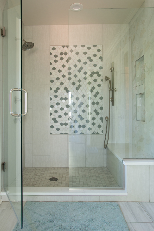
The walk-in shower is grand and elegant with a built-in niche for storage and a bench seat. Large rectangular tiles installed vertically make the shower look larger, and two shower heads provide the luxurious experience everyone desires in a custom shower. Decorative sea-glass accent tile in the center of the main shower wall draws the eye and creates movement, while glass shower entry doors elevate the design just enough to add modern style.
A Fresh Master Suite
This traditional home did not feature a large master suite like most newly built homes have today. “Popping the top” into the unused attic was an excellent way to construct a new master bedroom without removing space from other areas of the home. One of the challenges that emerged was how to add storage and function with the structure of the roof pitches and dormers. By embracing the shapes and sizes of the ceilings and “pushing” into the cavities of the framing, a more contemporary feel in the master was quickly achieved, which helped to transform the space into a modern retreat.
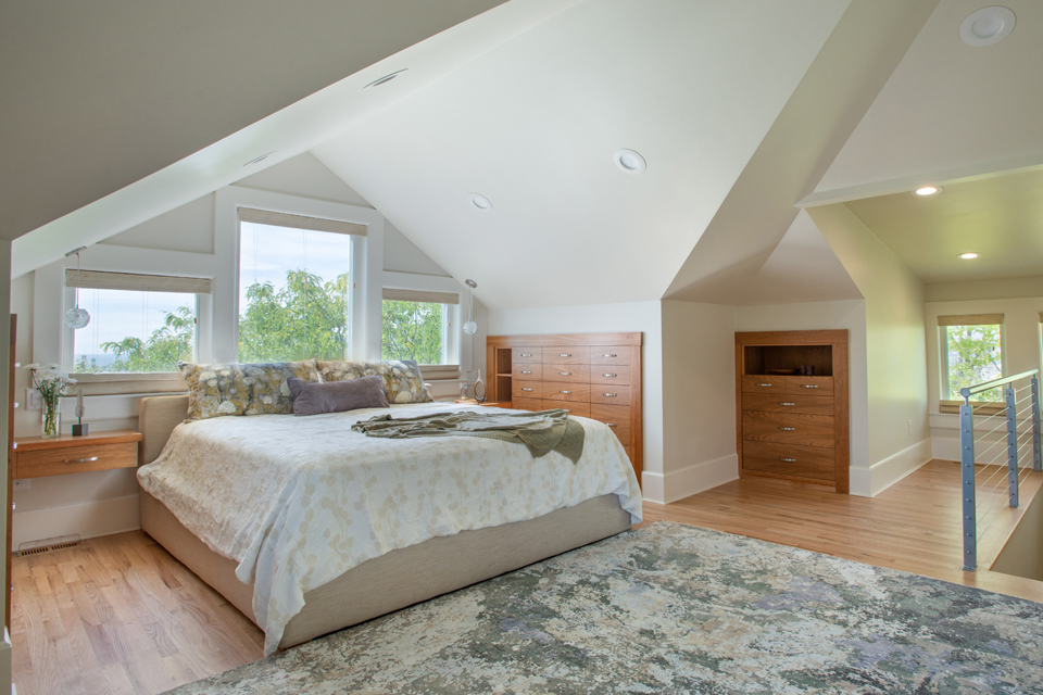
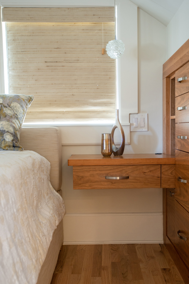
Because of the unique shapes and heights of the ceiling, the room also needed a special storage solution unlike any other. That solution meant integrating the desired storage into the cavities of the walls to add his and her dressers. The built-in dressers maintain the purity of the 1890s home and also enhance the modern design of the space thanks to their custom natural cherry construction. These dressers also leave plenty of room for décor and other pieces that help make the master functional.
While many attic spaces often feel dark, this master suite doesn’t, thanks to the sheer amount of light coming through the adequately sized windows. The addition of three dormers helped to create new brightness in this master suite. Three large windows behind the bed and two windows in the stairwell allow this bedroom to feel like it’s on the main floor. Recessed lighting installed throughout the space also boosts the amount of light in the room, with four fixtures above the bed, four near the staircase, and others spread throughout the ceiling.
A sitting area situated where one of the new dormers now exists gives space for reading, relaxing, or having a cup of coffee. Furnished with swivel chairs, this nook encourages multi-directional use so that homeowners can look out the window or face the beautifully designed master bedroom.
The addition of an abstract rug at the foot of the bed completes the design in the master suite, creating a subtle color scheme that isn’t flashy but still packs a contemporary punch. Playing off this color scheme with the bed pillows, comforter, and beige bed frame, the design stays trendy but keeps a classic style. Natural wood elements shine and help to maintain a sleek simplicity through the design, making this master suite feel fresh, modern, and composed.
The Staircase
It was necessary to create stairs to reach the new master suite, now located where the attic was. To do this, the fourth bedroom that was also used for the new bathroom was split to create a staircase that wraps around the corner up into the master. White oak wood planks installed on the stairs soften the modern design with charm, while tread lights illuminate the way at any time of the day. See-through wired railing at the top of the steps makes the staircase feel larger and pairs with the floors flawlessly.
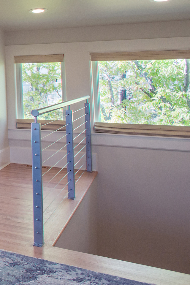
Continuing the concept of modern meets fresh farmhouse, the simple staircase adorned with a deep gray stair rail and tall baseboards completes the look of the upstairs master and offers the practicality needed in this original 1890s home. Windows at the top of the steps breathe light into the space while light walls brighten the look and feel of the new staircase.
Interior Design: BEAUTIFUL HABITAT INTERIOR DESIGN Photography: LIBBIE MARTIN Written by: CHRISTA PIRL